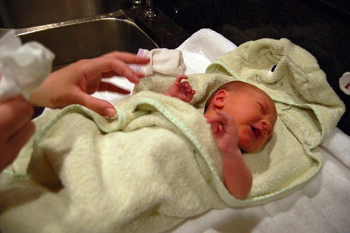
When it came time to work on a nursery for Wyatt, we had a few guiding thoughts in mind. First, we really wanted a room he could grow up in, not just outgrow. This meant picking designs and colors that weren’t all pastel, cute, and cuddly; but would be the sort of thing a young person would still find interesting.
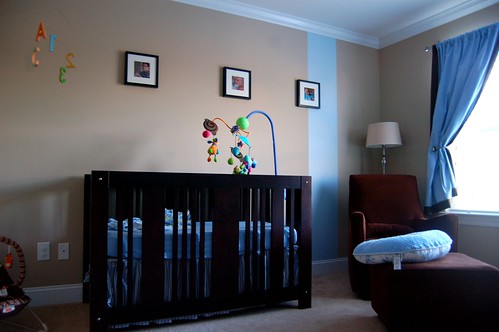
Secondly, we wanted to make a study in contrast to his sister, Ainsley’s room. Where her room has a pink color punch, light colored wood tones, and curved shapes; Wyatt’s room would have blue accents (okay, so the colors are hardly inspired), dark wood colors, and linear shapes.
Lastly, we do things on the cheap here at the Coleman-Dyer household. We would re-use many items that would fit in this design schema from around the house. So, this is the final result:

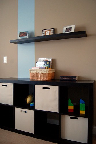
You’ll note another contrasting idea to Ainsley’s room is that of vertical stripes instead of the horizontal band of color. This is a very simple idea that seemed to work quite well when put along side the other elements in the room. The stripes become more architectural in this context. We also continued to use the idea of overlapping elements to tie the stripes into the furniture.

The crib was real find. We very happy with with Ainsley’s crib, so we turned to the same manufacturer (AP Industries) to see what they wold have. Needless to say, their Element crib ended up being the inspiration for a lot of the room. We were able to find the crib online at a great price (Albee Baby) and we purchased some conversion kits for toddler beds & full bed side rails at La Difference back in Richmond on a trip this past winter.

So, we’re very pleased with Wyatt’s room. I hope to add more robots & rocket ships as time goes on, but he may have a few things to say about that. Right now, we have some photos up on the walls and his sister likes to bring in some toys from her room to play while we read stories at night. That will do for decorations for now.
